as a previous artist (i still draw i just dont share it cuz i hate you all) i believe i have the right and ability to systematically go through this entire work and give a rather proper, fair, and opinionated rating; i'll also use proper grammar and stuff so that it's coherent
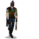
Line-work and Outlines: This is one of the first things for me to see in any artwork. Although Failureguy tends to draw with many lines and "detail," I don't find it very appealing in this case. Not only does the outline not match PB2's general style, but it seems a bit sloppy all around. The line widths differ in various parts of the skin, such as the actual outline itself and the little, 1px lines that accentuate the "detail" of the work. Also, some lines appear to be blurred, smoothed, smudged, and some just look rough in general. Most lines with separate colors surrounding them are rough, while the outlines are rather blurry themselves. On top of it all, the outlines are generally black; this cannot be helped considering the main color scheme to be grey, but I wish people used different color outlines. Not only would that help add depth to the armor, but it's what PB2 does - for the most part.
Coloring: The color scheme is bland. Albeit the visor is a bright yellow-ochre and the shield/sword/energy is red, the actual armor itself is nothing but a mesh of greys (and some whites). In my opinion, it comes off as dull to the eye, and it makes it difficult to differentiate parts of the armor separated from each other. Also, while not technically falling under a "color" critique, the filling of lines/spaces is somewhat botched. Although it's generally okay, it's clear in some spots that it wasn't done properly and/or to a fulfilling extent.
Style: It's becoming more and more "detailed" and sketchy in appearance. However, the many "details" don't really seem like details to me. The large number of lines and the differing widths looks a bit sloppy, in my opinion. In addition to that, there's the relatively-bland color scheme. I'm not tryna rag on this specifically, but a LOT of people nowadays stick with a rather dull, almost boring color scheme. I understand that greys, reds, and browns are typical colors of PB2, but it's even worse when it's not really done in that style; it doesn't match PB2's style. While PB2 is generally rounded and smooth (even in sharp-looking armor/weapons), this one is rather jagged and it has significantly thinner and more varied lines.
Concept: It's unique, but I find it to be rather odd. An elite unit of what? Why have a shield when his armor is 2 feet thick? Why have an energy tonfa rather than a sword/blade? The coloration doesn't help my understanding of it, but it's overall a decent concept. I don't have much to say about it, though.
General: It's ok. Truth be told, I've never been a fan of this style. I understand that not everyone can/wants to/should draw similarly or identically to PB2, however when it comes to PB2, the only reminiscent aspect of PB2 I see in this is the character shape/template. It's arguable that FG never had the intention of drawing in PB2's style nor ever will, but that's just my opinion. I don't think I'll ever really "like" the rugged, thin lines, but I do enjoy seeing people make unique fanart that's different from a typical real-gun-in-PB2-style or CS/beginner fanart.
TL;DR - not a fan, but its aight 6/10 (with 5 being a horribly "average/standard" fanart so 6 aint bad)
edit: some things
Elite Unit "3" Full Body
26 posts
• Page 2 of 2 • 1, 2
Re: Elite Unit "3" Full Body
![]() by Roxxar
by Roxxar ![]() » 23 September 2016, 05:42
» 23 September 2016, 05:42
-
Roxxar
- Civil Security Lite [100]
- Posts: 138
- Joined: 16 July 2013, 19:47
- Location: Trash Can
Re: Elite Unit "3" Full Body
![]() by Failureguy
by Failureguy ![]() » 24 September 2016, 21:01
» 24 September 2016, 21:01
Roxxar wrote:-A bunch of text-
Turns out that I might not really be suited to draw PB2 Style as I would feel a little uncomfortable with the work I come up with (My opinion.) Although it really is best that I would try to make it as PB2-ish as much as possible, it just doesn't fit my style. Every artist have different ways of expressing their arts after all.
Of course, the color was pretty bland, like you said. Many edges are sharp, many are blurred, therefore becoming into a bad result in the end, an insult to myself. However I am trying to learn to avoid causing such results to happen, it's just not working for me in the end (I used bucket tool to fill up the color, thats why).
As for the concept, uhhh, I was coming up with the concept of police (The shield and tonfa adds up, I hope), but the colors I chose was maybe wrong this time, should I have went for blue?
As I said before, the reason why I like "details" is because it's my style. I like to thank you for the feedback though, it really helps.
-

Failureguy
- Usurpation Soldier [50]
- Posts: 85
- Joined: 8 September 2013, 09:46
Re: Elite Unit "3" Full Body
![]() by tehswordninja
by tehswordninja ![]() » 24 September 2016, 22:34
» 24 September 2016, 22:34
Failureguy wrote:Roxxar wrote:-A bunch of text-
-a bunch of more text-
I think for a police type soldier the character is just too over armored and the colors don't really fit, but the skin as a whole is pretty cool.
i think basing your skins off pb2 skins would be a good idea.
-

tehswordninja
- Proxy [700]
- Posts: 705
- Joined: 10 November 2013, 17:24
- Location: Witty tagline
Re: Elite Unit "3" Full Body
![]() by wreak
by wreak ![]() » 28 September 2016, 00:38
» 28 September 2016, 00:38
Dude that looks amazing. Having a shield with you in battle could be so OP! Just imagine instead of slowing down time, you can strengthen your shield to stop incoming projectiles.
10/10
(ps: Don't mind the last sentence. I just sparked some creativity just looking at that artwork)
10/10
(ps: Don't mind the last sentence. I just sparked some creativity just looking at that artwork)
-

wreak
- Civil Security Boss [500]
- Posts: 577
- Joined: 23 January 2015, 02:01
Re: Elite Unit "3" Full Body
![]() by boom5
by boom5 ![]() » 29 November 2016, 23:27
» 29 November 2016, 23:27
That is the best skin I've seen so far. A space knight. Eric has to add this. 
-

boom5
- Usurpation Soldier [50]
- Posts: 97
- Joined: 11 August 2014, 17:09
Re: Elite Unit "3" Full Body
![]() by tehswordninja
by tehswordninja ![]() » 1 December 2016, 23:36
» 1 December 2016, 23:36
boom5 wrote:That is the best skin I've seen so far. A space knight. Eric has to add this.
Please don't nercopost, the last post was made over 60 days ago. Make sure to look at the date of the last post on a topic and if you wish to add a reply, send a pm to a staff member or ask them to bump it.
Topic locked.
-
tehswordninja
- Proxy [700]
- Posts: 705
- Joined: 10 November 2013, 17:24
- Location: Witty tagline
26 posts
• Page 2 of 2 • 1, 2
Who is online
Users browsing this forum: No registered users