Mhm wrote:Good job!

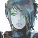
The character and the shield looks very cool.
I really like it!
Glad you like it!
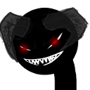
darkstar 1 wrote:Lines are small and it is detailed too much to be pb2 fan art, but that doesn't mean it is bad... it is awesome
")
Uhhh yeah, I just realized I overdid it, no matter, it still looks good doesn't it?
Protonoid wrote:Awesome man! I think the shield be the same... It looks nice.. However, if the shield will be removed, it will automatically increase character's mobility which should be an option..
Details are bit faded tho.
For that, I was trying to come up with an animation of the shield being able to retract it self and make it turn into a throwing circular-shape saw.
Another method for that was to make the shield turn into a temporary defense front, that way the soldier doesn't have to always carry the shield causing trouble, a way to show you:
KARL SERG wrote:It is way too detailed in my opinion, and it wouldn't hurt if you would make your Art simpler IMO. I imagine it would be easier to make on your part.
The shield would be better-looking if it was bigger, but given the sheer amount of detail, simply enlarging it without any rework would suffice, I believe.
What I said with darkstar, I overdid it. But well, I guess this could show what it could be if it were in PB2 version.
As for the shield, like this?:
Green Eyed Demon wrote:By far,you're the best character artist on this forum,can't say the same about the shield
I can't say that for sure but, thanks a lot! Glad you like it.
Terror Only wrote:the helmet looks awesome. shield is a good addition
calf needs more details. for now it's just black
what others have said - the artwork does not belong to this section as it doesn't fit pb2 style
overall body design could be better. the sword looks good and very practical for melee combat
7/10
Hmm, that's kinda bad if it really doesn't belong to this section. As for the color scheme since it's black, I tested other colors to match with the character itself, however as it seems, it doesn't sit right for me after all.
The sword was actually half baton half sword (I actually wanna put the name as police force, but that seems a bit out of place for PB2.). Noted, thanks for the feedback!
GhostX5 wrote:That looks so amazing, man!
I guess that's what I think it's missing in PB Series, we need a character who would have to use a shield to be the point man of the team who is fierce about the protection.
Once he has his shield on, he would say "Stay behind me." or "Get behind me!" Would be a good feature to any character who is pulling out his or her own shield for protection or extra cover.
One would think about now as to how they defend themselves if it is to save yourself out of bullet hell.
Glad you like it!
Moonhawk wrote:I don't mind the detail, but yeah, it's way too much for PB2 or PB2.5. The design and the colour scheme doesn't really fit any character or faction well except maybe the Marine. The shield, eh, I don't like it that much to be honest.
It does remind me quite a bit of the main hero in Intrusion 2.
To be honest, all of the characters I made so far are related to special forces (Not related to CS or marine whatsoever, just a fiction group I created to imagine what if they were in the game itself), therefore resulting not really fitting into any factions.
Color scheme wise, like I said with Terror Only, I feel like it doesn't sit right with me if I went for other colors. I could try but my vision for the character was like a police (The sword was like a hint itself)
I saw someone said my other character looked like intrusion 1, oh gawd i never played that game.artichokecat wrote:The detail may be a bit much but it's nice.
The shield reminds me of their usage in Garuda's story.
(Is that where you got the idea?)
Perhaps the skin could be used an an alternate or advanced version
of the Advanced Usurpation Soldier skin.
I didn't read Garuda's/Hikarikaze's story since I didn't have the feel to read it, guess I'll have to read it soon.
Detail wise, I know.
I like to think of it as a defense unit for this character, oh well. Glad you like it.


